Introduction
Restoring a Victorian home restoration is like uncovering a piece of history. From ornate woodwork to intricate moldings, every detail tells a story of craftsmanship and artistry. One of the most transformative aspects of any Victorian restoration is choosing the right historic paint colors and finishes. The right palette not only enhances architectural beauty but also preserves the authenticity that makes these homes timeless, as seen in various historic decor ideas.
In this guide, we'll explore the historic color schemes, traditional finishes, and expert tips to help you revive your Victorian home with period-accurate charm and modern durability.
This expanded edition goes even further — it's now a complete color reference for both the exterior and interior of a Victorian home. You'll find a curated library of 25 historic paint colors with visual swatches, a step-by-step approach to planning your palette, a look at how the same pigments beloved by 19th-century painters found their way onto Victorian walls and clapboards, and answers to the questions restoration homeowners ask most often. Whether you're planning a full multi-color exterior or simply refreshing a parlor with period-appropriate hues, this guide is built to be your primary reference from start to finish.
The Beauty of Victorian-Era Paint Palettes
Victorian architecture spanned from the 1830s to the early 1900s, encompassing styles such as Gothic Revival, Italianate, Queen Anne, and Folk Victorian. Each period brought unique color trends influenced by technology, culture, and design movements.
• Early Victorian (1830–1860): Colors were muted and nature-inspired, featuring soft tans, olives, ochres, and stone grays.
• Mid-Victorian (1860–1880): Advances in paint manufacturing introduced richer hues—deep reds, greens, and browns became popular.
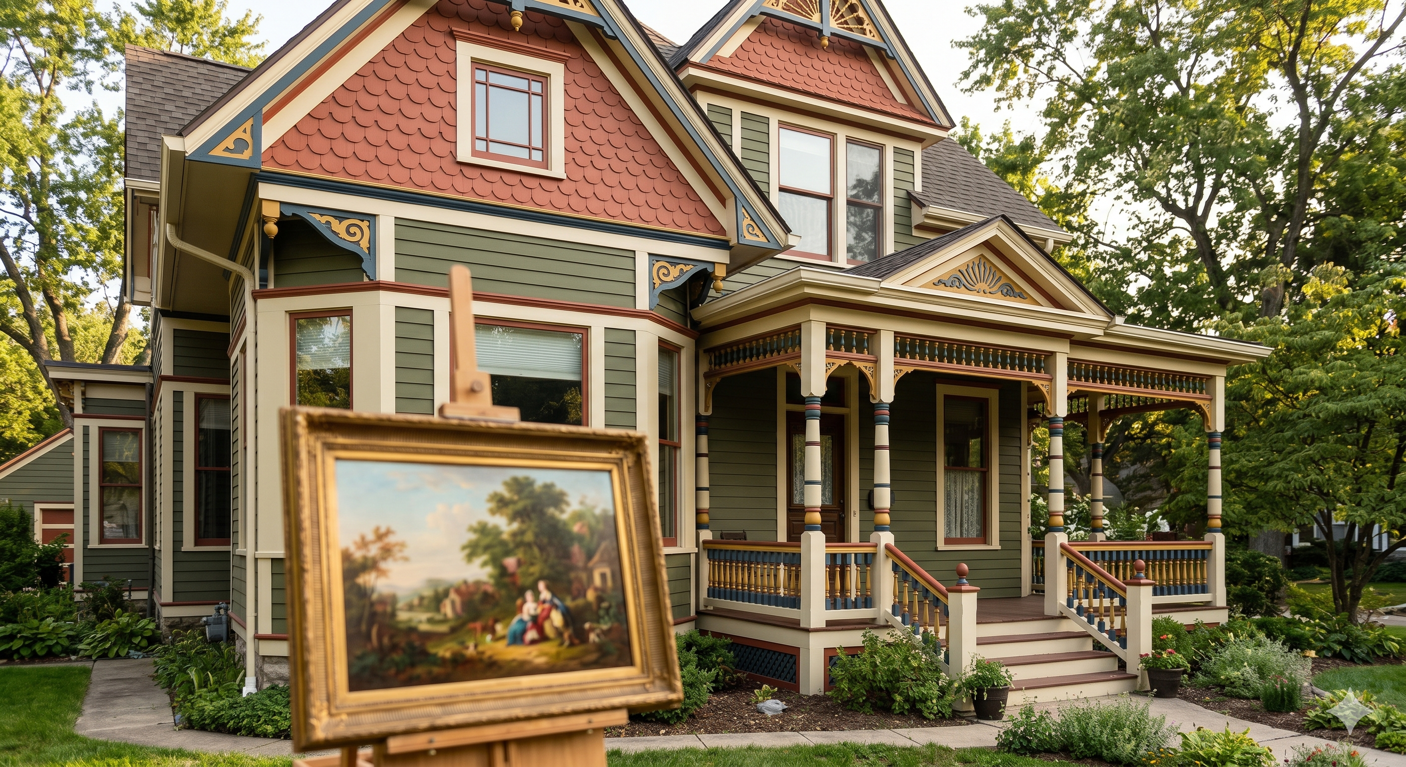
• Late Victorian (1880–1900): The Queen Anne era embraced bold contrast and elaborate trim. Expect striking combinations of terracotta, gold, burgundy, and forest green.
These layered, harmonious tones emphasized architectural depth, from decorative brackets to window trims.
Color Trends by Architectural Style
Gothic Revival (1840s–1860s): Pointed arches and steep gables called for grounded, earthy colors — deep olive, stone gray, and soft brown — that reinforced the style's romantic, medieval-inspired seriousness rather than competing with its dramatic silhouette.
Italianate (1850s–1880s): Tall, boxy forms with bracketed cornices favored warm, substantial body colors like chocolate brown or warm taupe, with cream or pale gold used to pick out elaborate window hoods.
Second Empire (1860s–1880s): The mansard roof's formality was often matched with dignified, cooler tones — slate gray or muted blue bodies with dark trim — echoing the fashionable French-influenced architecture of the period.
Stick and Eastlake (1870s–1890s): Exposed structural 'stick work' and heavy applied ornament were often highlighted with a third or fourth color, since the goal was to make the decorative framework itself legible from the street.
Queen Anne (1880s–1900s): The most exuberant of the Victorian styles, Queen Anne homes carried the boldest, most varied palettes — often five or more colors distinguishing shingles, clapboards, trim, sashes, and spindle work from one another.
Folk Victorian (1870s–1900s): Simpler farmhouse forms with Victorian-inspired porch trim typically used just two or three colors, prioritizing economy and durability over elaborate multi-color schemes.
The Chemistry Behind the Palette
Victorian color trends weren't only a matter of taste — they tracked closely with what pigments were actually available and affordable. In the early 1800s, paint was still often mixed by hand from a limited set of pigments: iron oxides for reds and browns, lime and chalk for whites, and earth pigments like ochre and umber. This is why Early Victorian palettes lean so heavily on muted, earthy tones.
By the 1850s and 1860s, industrial pigment production expanded dramatically. Chrome yellow, chrome green, and Prussian blue became widely available and comparatively inexpensive, which is exactly when richer greens, deeper reds, and more saturated browns start showing up on Victorian homes. By the 1870s and 1880s, an even wider range of synthetic pigments — along with pre-mixed, ready-to-use paints sold by national manufacturers — made the bold, multi-color Queen Anne palette commercially practical for the first time.
It's worth noting that many original Victorian paints contained lead, and some greens of the period contained arsenic-based pigments like Paris Green or Scheele's Green. Today's historically accurate paint collections replicate the look of these colors using modern, lead-free and non-toxic formulations — you get the authentic hue without the historic hazard.
There's also a practical reason so many Victorian exteriors used three or more colors rather than one: paint itself was still relatively expensive relative to household income through much of the 19th century, and using a less-expensive body color across the largest surface area, reserving costlier or more labor-intensive pigments for smaller trim and accent areas, was simply good budgeting. That same logic still holds up today — a well-chosen, less expensive body color paired with a couple of premium accent colors on doors and trim can deliver the full historic look without the cost of coating an entire facade in your most expensive paint.
Authentic Exterior Color Schemes
When selecting exterior paint colors for a Victorian home, balance and hierarchy are key. Most Victorian exteriors used three to five coordinated colors to highlight structural features.
• Body Color: Usually a medium tone that defines the overall look (e.g., moss green, slate blue, or warm taupe).
• Trim Color: Lighter or darker than the body to create contrast and frame architectural details.
• Accent Color: Bold tones—like oxblood red or mustard—applied to doors, gables, or window sashes for visual interest.
For a truly historic restoration, study old paint layers on your home's woodwork or research regional Victorian palettes. Paint manufacturers often offer heritage collections inspired by original 19th-century formulations.
How Many Colors Should You Use?
There's no single correct number, but historic precedent gives a useful range. Folk Victorian homes with simple trim typically read best with two to three colors. Italianate and Second Empire homes, with their heavier cornices and window hoods, generally carry three to four colors well. Highly ornamented Queen Anne and Stick-style homes — with their spindle work, fish-scale shingles, and layered porches — are where the classic five-to-seven-color 'Painted Lady' treatment really earns its keep. As a rule of thumb, the more distinct architectural elements your home has, the more colors it can support without looking busy.
Regional Influences on Victorian Color
Victorian color trends weren't identical nationwide. San Francisco's famous 'Painted Ladies' popularized the boldest, most saturated multi-color schemes, partly as a reaction against decades of mandated gray and white paint in the mid-20th century. New England Victorians tended toward more restrained grays, whites, and deep greens reflecting a more conservative regional taste. Southern Victorian homes often used lighter, cooler colors suited to the climate, while Midwestern farmhouses leaned on the same earthy, economical tones used for barns and outbuildings. When researching your own home's palette, regional historical societies and preservation groups are often more useful than a single national 'Victorian color' standard.
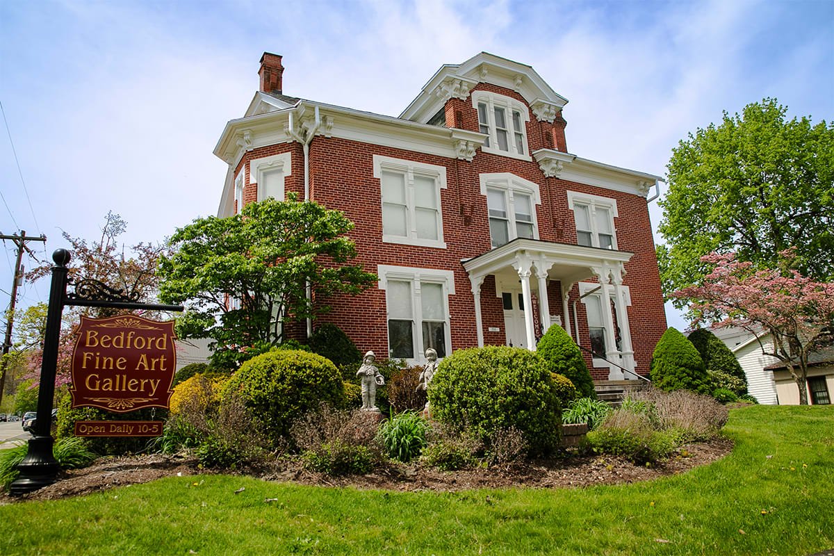
Here in Pennsylvania, Victorian homes tend to split the difference — you'll find both the restrained, New England-influenced grays and greens in older river towns, and bolder, more elaborate Queen Anne palettes on homes built during the state's late-19th-century industrial boom. If you're restoring a Victorian home in Bedford or a similar Pennsylvania town, local historical society photo archives are often the single best resource for confirming what colors were actually used on homes like yours, since regional paint suppliers and popular local tastes shaped choices as much as national style trends did.
Choosing Body, Trim, and Accent Together
The most successful historic schemes pair a body color with a trim color one or two shades lighter or darker on the same undertone — a warm taupe body with a warm cream trim, for instance — rather than a stark, high-contrast jump. Accent colors, by contrast, are meant to stand apart: a cooler sage or slate body reads beautifully against a warm oxblood or terracotta door. If you're unsure where to start, pick your body color first, choose a trim color from the same 'temperature' family, and then select just one accent color to carry through doors, sash, or gable details.
Common Exterior Color Mistakes to Avoid
Going too bright: Modern paint formulations can produce far more saturated colors than 19th-century pigments ever achieved. A historically 'bold' Queen Anne terracotta is still noticeably softer and more muted than a same-named color you might find in a contemporary exterior collection — when in doubt, choose one shade quieter than your first instinct.
Ignoring the roof color: Slate, wood shake, and later asphalt roofing all carry their own strong undertones. A body color that clashes with a cool gray slate roof or a warm brown shake roof will fight the house's largest single surface no matter how carefully the rest of the palette is chosen.
Too much contrast, too fast: It's tempting to pick every color at maximum contrast for visual drama, but Victorian painters generally built contrast gradually — body, then a step lighter or darker for trim, then a genuine accent only on the smallest, most ornamental elements.
Skipping the primer step: Bare or previously bare wood, and any repaired areas, need appropriate primer before a historic-color topcoat. Skipping this step is the single most common cause of early paint failure on older wood siding, regardless of how accurate the color itself is.
The Top 25 Historic Victorian Paint Colors (With Swatches)
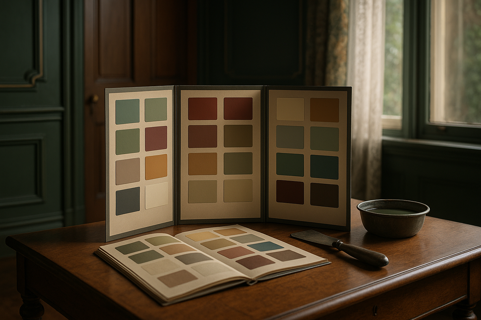
To make color selection easier, we've pulled together a reference library of 25 historically grounded Victorian colors, organized by where they were most commonly used. Each swatch below reflects a color family genuinely associated with the period — use it as a starting point, then compare against a heritage color collection from your paint manufacturer of choice, since exact formulations vary.
Swatch | Color Name | Category | Historic Use & Description |
| Sage Green #8FA37E | Exterior Body | A muted, blue-leaning green popular for Queen Anne and Stick-style bodies from the 1880s onward. Pairs beautifully with cream trim and oxblood accents; echoes the greens found in period botanical wallpapers. |
| Warm Taupe #A68A64 | Exterior Body | A versatile, nature-inspired neutral common across every Victorian sub-style. Reads warmer than a modern greige and works especially well on Folk Victorian and Italianate facades. |
| Slate Blue #5F7A82 | Exterior Body | A soft, grayed blue favored in Mid-Victorian coastal and Northeastern towns. Historically achieved with early synthetic ultramarine and Prussian blue pigments blended with white lead. |
| Stone Gray #948C7E | Exterior Body | One of the most common Early Victorian (1830–1860) body colors, meant to mimic quarried stone on modest wood-frame homes before bold color became fashionable. |
| Barn Red #7B2A22 | Exterior Body | An economical, iron-oxide-based red used on Folk Victorian farmhouses. The same affordable pigment that colored period barns made its way onto simpler village houses. |
| Moss Green #62754A | Exterior Body | A deep, olive-leaning green tied to the Aesthetic Movement of the 1870s–80s, when designers pushed back against pastel Victorian color in favor of earthier, art-inspired tones. |
| Chocolate Brown #4B3524 | Exterior Body | A rich, grounded brown used on Mid- to Late-Victorian Italianate homes to set off cream window hoods and dark green shutters. |
| Cream Ivory #F1E8D2 | Exterior Trim | The single most common Victorian trim color across every style and decade, used to frame windows, cornices, and porch details without competing with the body color. |
| Charcoal Sash #3A3B3D | Exterior Trim | A near-black used almost exclusively on window sashes, since dark sashes reduce glare and make the glass itself appear larger and darker — a period trick still used today. |
| Indigo Trim #38455E | Exterior Trim | A deep blue-black trim color found on Second Empire mansard-roof homes, often paired with a slate-gray body for a dignified, formal presentation. |
| Forest Green Trim #2E4632 | Exterior Trim | Standard shutter and porch-rail color from the 1860s onward; its availability tracks directly with the introduction of affordable chrome-oxide green pigment. |
| Dove Gray #B9B4A8 | Exterior Trim | A gentle, light gray trim that softens the contrast on bolder Queen Anne body colors while still reading as historically correct rather than modern white. |
| Golden Straw #C9A227 | Exterior Trim | A warm, muted gold used to pick out porch brackets, spindle work, and gable trim on Eastlake and Stick-style homes with heavy applied ornament. |
| Oxblood Red #4E1E1E | Exterior Accent | The classic Victorian door color — deep, almost brown-red, meant to convey formality and warmth at the entry without overwhelming the rest of the palette. |
| Mustard Gold #C4901F | Exterior Accent | A bold accent for gables, sash details, and door panels, especially on Queen Anne homes where multiple accent colors were layered across ornamental trim. |
| Terracotta #C1633F | Exterior Accent | A warm, brick-toned accent popular in the 1880s–90s, often used on shingled gable ends to contrast with a cooler body color like slate blue or sage. |
| Burgundy #5B1B2C | Exterior Accent | A jewel-toned accent for shutters and door surrounds on Late Victorian homes, frequently paired with forest green trim and a stone-gray or taupe body. |
| Parlor Green #3A4A33 | Interior | A deep, saturated green for formal parlors and libraries — the Victorian answer to today's 'moody' interior trend, meant to be enjoyed by lamplight and firelight. |
| Library Brown #4A3626 | Interior | A warm, tobacco-toned brown for wood-paneled studies and libraries, chosen to recede against dark bookcases and leather furnishings rather than compete with them. |
| Dining Room Gold #B08334 | Interior | A rich, candlelight-flattering gold used almost universally in Victorian dining rooms, where warm tones were believed to aid digestion and conversation alike. |
| Rose Blush #CFA09B | Interior | A soft, dusty pink for bedrooms and dressing rooms, balancing the heavier tones used elsewhere in the house with a lighter, more intimate palette. |
| Powder Blue #A7C0D6 | Interior | A pale, restful blue for bedrooms and bathrooms, prized for its calming quality and its ability to brighten rooms with limited natural light. |
| Deep Teal #1E4B47 | Interior | A signature Aesthetic Movement color of the 1870s–80s, associated with designers like Christopher Dresser and used on woodwork, friezes, and stairwells. |
| Dusty Plum #6E4A5E | Interior | An unusual but authentic Late Victorian accent for hallways and stairwells, reflecting the era's growing comfort with unconventional, artistic color pairings. |
| Butter Cream #EFE0B0 | Interior | A soft, warm cream for ceilings and upper walls above a picture rail, used to keep tall Victorian rooms from feeling overly dark despite bold lower-wall colors. |
Interior Paint Colors and Finishes
Inside a Victorian home, walls were often rich with depth and texture. Natural pigments created earthy, warm tones that complemented dark woods and heavy draperies.
Popular Interior Colors:
• Deep greens and browns for parlors and libraries
• Warm creams, golds, and rose tones for dining rooms
• Pale blues and grays for bedrooms and bathrooms
Historic Finishes:
Victorian interiors frequently used matte and eggshell finishes, which mimicked the soft, natural look of limewash or distemper paints. High-gloss finishes were reserved for trim, doors, and wainscoting to create subtle contrast and easier cleaning.
For authenticity, consider using milk paint, linseed oil paint, or mineral-based formulations. These traditional finishes age gracefully and allow wood surfaces to breathe.
Room-by-Room Historic Color Guide
Parlor and library: The most formal rooms in the house carried the deepest colors — forest or hunter green, tobacco brown, or oxblood — meant to feel rich and enveloping by gaslight or firelight.
Dining room: Warm gold, amber, and burnished orange tones were thought to flatter both food and complexion under candlelight, and remain one of the most historically consistent Victorian room colors.
Bedrooms: Softer, lighter colors — dusty rose, powder blue, pale sage — created a deliberate contrast with the heavier public rooms downstairs and were thought to promote rest.
Kitchen: Practical, light colors such as cream or pale gray-green were common, since kitchens were work spaces first and needed to feel bright and clean rather than opulent.
Entry hall and stairwell: Often the boldest interior space in the house, entry halls sometimes carried a deep, saturated color like burgundy or plum to make a strong first impression.
Bathroom: Where indoor plumbing existed, pale blues and soft grays were preferred, chosen for a fresh, clean feel that suited the room's new, distinctly modern function.
Ceiling and Trim Treatments
Victorian ceilings were rarely flat white. The most common approach was a lighter tint of the wall color, or a warm cream, which kept a tall room from feeling cold while still allowing decorative plaster medallions and cornices to stand out. Where a picture rail was present, many homes used a distinct treatment above it — often the cream ceiling tone — creating a visual break between the 'display zone' for art and the richer color below. Wainscoting and dado panels were typically painted in a contrasting trim tone, both to protect the lower wall from daily wear and to add another layer of coordinated color to the room.
From Canvas to Clapboard: The Artist's Palette in Victorian Homes
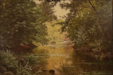
It's not a coincidence that Victorian house paint and Victorian fine art share so much visual DNA. Nineteenth-century painters and nineteenth-century house painters were drawing from largely the same pigment supply — the same ochres, umbers, chrome yellows, Prussian blues, and iron-oxide reds that colored an artist's canvas were also being ground into the linseed-oil house paints sold to homeowners. When a Hudson River School landscape painter reached for a warm burnt sienna to render an autumn hillside, a paint manufacturer just a few years later was mixing that same earth pigment into a 'fashionable' exterior body color.
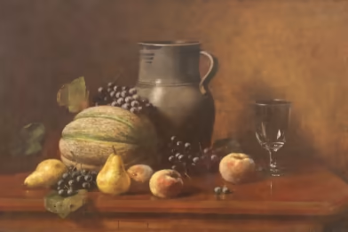
This shared palette is easiest to see in genre paintings of the period — interior scenes that show parlors and sitting rooms in the exact deep greens, golds, and burgundies discussed above. Artists weren't just depicting Victorian rooms; they were often working with pigments drawn from the same suppliers that stocked the local paint and hardware store. Studying period paintings, in other words, is a genuinely useful (and often overlooked) way to research historically accurate color.
If you'd like to see these pigments in person rather than on a screen, original 19th-century paintings are one of the best references available — the way pigment sits on canvas, ages, and reflects light tells you things a modern paint chip can't. The Bedford Fine Art Gallery in Bedford, Pennsylvania, houses more than 300 original 19th-century paintings, many from the same landscape and genre traditions that shaped Victorian interior color. Spending an afternoon there, alongside your paint fan decks, is a genuinely useful step in planning an authentic restoration — and a reminder that Victorian color choices were never just decorating decisions, they were part of the same visual culture that produced the era's fine art.
Tips for a Successful Victorian Restoration
1. Research Before You Paint: Identify your home's architectural style and construction period. Each era had distinct color traditions.
2. Use Period-Inspired Palettes: Many modern paint brands offer historic color collections that simplify selection.
3. Test Samples in Natural Light: Colors can look dramatically different depending on lighting and surroundings.
4. Highlight the Details: Use accent colors to emphasize corbels, spindles, and brackets—the hallmarks of Victorian design.
5. Preserve Original Materials: When possible, strip paint carefully and repair original wood rather than replacing it.
Step-by-Step: Planning Your Victorian Color Scheme
6. Identify your home's style and era. A Folk Victorian farmhouse and a high-Queen-Anne home call for genuinely different color strategies, so start by confirming what you're actually working with.
7. Research before you buy paint. Check local historical society archives, old photographs, and building records for clues to your home's original palette.
8. Look for physical evidence. A small, careful paint-layer sample in a protected spot — like under a porch eave — can reveal your home's actual color history.
9. Choose your body color first. This is the anchor for everything else and should suit both your home's style and its surroundings.
10. Select a trim color in the same undertone family. Aim for gentle contrast rather than a jarring jump between body and trim.
11. Add one or two accent colors. Reserve these for doors, sash, and the most ornamental trim details — more than two accents can start to look busy on all but the most elaborate homes.
12. Test large samples, not tiny chips. Paint a full poster-board-sized sample and view it at different times of day before committing.
13. Match finishes to surface and function. Matte or eggshell for body color, higher sheen for trim and doors, and always confirm your product is rated for exterior or interior use as appropriate.
14. Confirm lead-safe practices before any prep work. Any home built before 1978 should be tested before sanding, scraping, or stripping old paint.
Modern Durability Meets Historic Accuracy
Today's high-performance paints can replicate historic hues while offering superior weather resistance and longevity. Low-VOC and eco-friendly options also help maintain a healthy home environment without sacrificing authenticity. By blending traditional aesthetics with modern technology, you can ensure your Victorian restoration stands the test of time.
In practice, this usually means choosing a 100% acrylic exterior paint for the best combination of flexibility, fade resistance, and breathability on wood siding — acrylics move with the wood through temperature and humidity swings far better than older oil formulations. For homeowners who want an even more traditional look and feel, mineral silicate paints and limewash-style products offer a genuinely historic matte finish while still meeting modern durability standards. Whatever product you choose, always confirm it's appropriate for your specific siding material, and follow EPA Renovation, Repair, and Painting (RRP) guidelines if your home was built before 1978. A quality exterior repaint on a well-prepped Victorian home should typically last 8 to 12 years before it needs attention again, though sun-exposed elevations may need touch-ups sooner.
Budgeting for a Historic Repaint
A full multi-color Victorian exterior repaint costs meaningfully more than a single-color modern home, largely because of labor rather than paint itself — cutting in clean lines around brackets, spindles, and window hoods takes considerably more time than rolling a flat wall. Most of your budget should go toward proper surface preparation: scraping failing paint, sanding, priming bare wood, and addressing any rot or lead-paint concerns before a single finish coat goes on. It's worth getting quotes from painters who specifically advertise historic or Victorian-home experience, since they'll price and sequence the multi-color work correctly the first time rather than treating your home like a standard single-color repaint with some extra trim.
If budget is a constraint, a common and historically reasonable compromise is to prioritize the body and trim colors in year one, then add a bolder accent color to doors and select ornamental details in a later phase — this mirrors how many original Victorian homeowners approached paint as a series of investments rather than a single, all-at-once expense.
Frequently Asked Questions
What were the most common Victorian house colors?
Across the full 1830–1900 span, the most common colors were earthy and muted: stone gray, olive, warm taupe, and soft ochre in the early decades, shifting toward deeper reds, greens, and browns by mid-century, and finally the bolder, multi-color Queen Anne combinations of terracotta, gold, and burgundy by the 1880s and 1890s.
Were Victorian houses really painted in bright, multiple colors?
Some were, especially high-style Queen Anne and Eastlake homes from the 1880s onward, which could carry five to seven colors. But the majority of Victorian-era houses — modest Folk Victorian and Italianate homes especially — used just two or three coordinated, fairly muted colors. The vividly multi-colored 'Painted Lady' look most people picture today is a real historic style, but it was never the universal norm.
What paint finish is most historically accurate?
Matte and eggshell finishes on walls and body color, with a slightly higher sheen (satin or gloss) reserved for trim, doors, and high-touch woodwork. This matches how limewash, distemper, and early oil paints actually behaved, and it's still the most authentic-looking approach with modern paint.
How many colors should I use on a Victorian exterior?
Three is a safe, historically grounded starting point for most homes: one body color, one trim color, and one accent. Homes with more elaborate millwork — brackets, spindles, fish-scale shingles — can support four to seven colors, which is the traditional 'Painted Lady' approach.
Is it safe to sand or scrape old Victorian paint?
Not without precautions. Any home built before 1978 should be assumed to have lead-based paint in at least some layers. Dry sanding or scraping can create dangerous lead dust. Work with an EPA RRP-certified contractor, use wet-sanding or chemical stripping methods, and have paint tested before any large-scale removal.
What's the difference between 'Victorian colors' and 'Painted Lady' colors?
'Victorian colors' is the broad historical category covering everything from muted 1840s stone gray to bold 1890s Queen Anne combinations. 'Painted Lady' refers specifically to the multi-color, high-contrast exterior treatment — often three or more accent colors picking out every piece of trim — that became a signature (and later a 20th-century revival trend) of San Francisco's Victorian row houses.
Should interior and exterior colors relate to each other?
They don't need to match, but a coordinated approach reads as more intentional. Many restorers echo one exterior accent color — say, a deep green shutter color — somewhere inside, often in a front hall or parlor, to create a visual thread between the two.
What is milk paint, and should I use it?
Milk paint is a traditional, casein-based paint that was common before modern latex and oil formulations. It produces an authentic, slightly chalky matte finish and is popular for furniture and interior woodwork restoration. It's less commonly used for full exterior repaints today because modern acrylics offer far better weather resistance.
How do I find my home's original colors?
Look for small, protected paint 'stratigraphy' — chip away a tiny cross-section in an inconspicuous spot (like under a porch eave) to see the layers of color history. Local historical societies, old photographs, and building permit records can also help. Some restoration paint companies offer paint-layer analysis services for a more precise reading.
Do modern paints come in historically accurate Victorian colors?
Yes. Most major paint manufacturers offer dedicated heritage or historic-preservation color collections researched from archival samples, often organized by decade or architectural style, which makes it much easier to select an accurate palette without guesswork.
How long does a historic Victorian exterior repaint take?
For a full multi-color scheme, plan on several weeks rather than a few days, especially once proper surface preparation is factored in. Scraping, sanding, priming, and repairing any damaged wood typically takes longer than the painting itself, and a home with heavy ornamental trim needs extra time for careful cutting-in around brackets, spindles, and window details.
Can I mix historic colors with a modern, more neutral interior?
Absolutely — many restorers use bold, period-accurate colors in formal rooms like the parlor or dining room while keeping bedrooms, bathrooms, or a home office in a quieter, more contemporary palette. This isn't historically inaccurate so much as it reflects how even Victorian households varied color intensity by room; a full-house museum treatment was never actually required.
Conclusion
Choosing historic paint colors and finishes for your Victorian home is more than an aesthetic decision—it's an act of preservation. The right palette brings back the grandeur of a bygone era, celebrating the artistry and spirit that define Victorian architecture. Whether you're restoring a grand Queen Anne or a charming Folk Victorian cottage, let your paint choices honor the history behind every intricate detail.
From the muted stone grays of the 1830s to the bold, layered palettes of the 1890s, Victorian color was never arbitrary — it reflected available pigments, regional taste, and the same artistic sensibility that shaped the era's fine art. Use the swatch library and step-by-step guide above as your starting point, and don't hesitate to see the era's original color firsthand in period paintings as you plan your own restoration.
If you take away one thing from this guide, let it be this: historic accuracy and personal taste aren't actually in conflict. The Victorians themselves worked within a genuinely wide range of colors across styles, regions, and budgets — your job isn't to find the one 'correct' Victorian palette, but to find the combination within that historic range that suits your home, your street, and the story you want your restoration to tell.
Publishing Notes (for internal use — remove before publishing)
The following is not part of the article and should be deleted from the final page. It's included here so the image, alt-text, and SEO recommendations travel with the draft.
Meta title & description (unchanged — preserves current SEO equity)
Title: Historic Paint Colors and Finishes for Victorian Homes: A Restoration Guide | Victorian Home Decor
Meta description: Revive your Victorian home with our guide on historic paint colors and finishes. Discover authentic palettes and expert tips for a stunning restoration.
URL / slug: keep exactly as-is — /blog/victorian-restoration/historic-paint-colors-and-finishes-for-victorian-homes-a-restoration-guide
Image & alt text recommendations
• Hero image (existing) — keep as-is; it's already indexed with the current URL.
• Restored Queen Anne exterior in a 3-color scheme — alt: "Restored Queen Anne Victorian home painted in a coordinated historic exterior color scheme"
• Porch bracket/spindle detail shot — alt: "Close-up of Victorian porch brackets and spindle work painted in coordinated body, trim, and accent colors"
• Flat-lay of the 25 paint swatches (photograph real chips, not the table graphic) — alt: "Flat lay of historic Victorian paint color swatches organized by exterior and interior use"
• Bedford Fine Art Gallery interior — alt: "Original 19th-century paintings on display at Bedford Fine Art Gallery in Bedford, Pennsylvania"
• Consider a room photo (parlor or dining room) in one of the 8 interior colors if available from a past project.
Other SEO notes
• H1/H2/H3 structure preserved and expanded — original H2s kept verbatim, new H2/H3s added around them so existing keyword associations aren't disrupted.
• Both internal links from the original article (Victorian home restoration, historic decor ideas) are preserved above — add 2–3 more internal links from other blog posts pointing to this page to reinforce its authority now that it covers more ground.
• Target additional long-tail queries now covered: 'Victorian interior paint colors', 'Victorian exterior paint colors', 'Painted Lady colors', 'historic paint color chart', 'Victorian house color FAQ'.
• Word count of article body (excluding this notes section): approximately 5,000 words.